Web Design Styleguide
Foundational styling for SAIT's look and feel on the web.
Our logo
Our logo consists of the catalyst and wordmark. There is no primary or secondary logo, the use of the vertical or horizontal logo depends on the space. Hover over logos for spacing requirements. Generally allow for at least 0.5rem of space around the logo. Use SVG whenever possible. Do not use the wordmark without the catalyst.
Due to trademark specifications and the need to uphold our logo's image, third parties must request the logo through the Marketing department.
Vertical
Horizontal
The Catalyst
The catalyst itself is often used as an accent piece throughout sait.ca. A light grey catalyst can be used against a white background similar to the hero area of this page. Using a semi-transparent white catalyst over images or colour backgrounds is also allowed. As long as the shadow details are kept.
What not to do
The integrity of the logo should not be compromised by changing any of the individual elements. Do not distort or stretch the logo, do not change the font of the lockup, or change the relationship between the elements. More examples of the dos and don'ts can be found in our brand guidelines.
Our colours
Red and blue are SAIT's primary colours. The secondary colours compliment the primary colours with more energizing hues to reflect our diversity, adaptability and innovation. Other colours are also used throughout the site as accents or as branding for specific areas of SAIT.
Primary colours
Light red
#DA291C
rgb(218, 41, 28)
Dark blue
#005EB8
rgb(0, 94, 184)
Secondary colours
Purple
#6D2077
rgb(109, 32, 119)
Light blue
#00A3E0
rgb(0, 163, 224)
Dark red
#A6192E
rgb(166, 25, 46)
Other colours and accents
Main text colour
#324053
rgb(50, 64, 83)
Natural blue
#00A4E0
rgb(0, 164, 224)
Salmon
#F69B99
rgb(246, 155, 153)
Coral reef
#F37468
rgb(243, 116, 104)
Lilac
#946EB0
rgb(148, 110, 176)
Sky magenta
#CE76B1
rgb(206, 118, 177)
Middle blue
#7CD2EE
rgb(124, 210, 238)
Text
Titillium Web - headings, main navigation, buttons, lead paragraphs. Download here.
DM Sans - paragraphs, breadcrumbs, main body text. Download here.
h1. Heading 1 (44px, 2.75rem)
h2. Heading 2 (37px, 2.3rem)
h3. Heading 3 (28px, 1.75rem)
h4. Heading 4 (24px, 1.5rem)
h5. Heading 5 (20px, 1.25rem)
h6. Heading 6 (18px, 1.125rem)
Lead paragraph text (21px, 1.3rem). Fugiat, vel consectetur harum delectus quaerat itaque tenetur voluptatibus eius incidunt. Perspiciatis molestias vel soluta delectus odit nulla obcaecati, quasi at necessitatibus iure adipisci, assumenda exercitationem similique, doloremque repellat quos.
Main body text (17px, 1.0625rem). Lorem ipsum dolor sit amet consectetur adipisicing elit. Quod consectetur modi officia minus fuga est laudantium non aspernatur, consequatur at facilis ipsa accusamus explicabo. Non doloribus doloremque odio deserunt? Link text.
Secondary body text (14px, 0.875rem). Reiciendis, vero? Dolores consequuntur et accusamus aspernatur sed veritatis explicabo, dolor similique ducimus. Error, deserunt inventore eligendi iure labore debitis, possimus provident quam veritatis obcaecati repudiandae unde molestias est atque?
Buttons
Icons
The primary icon library used on sait.ca is ionicons. Generally, the outline or filled styles are used. Our custom designed icons follow a similar look and feel. For example, icons used for Open House page:
Visual language
Our website uses bold, friendly colours and clear, straight-forward language. We want users to be excited about SAIT but also get all the information they need.
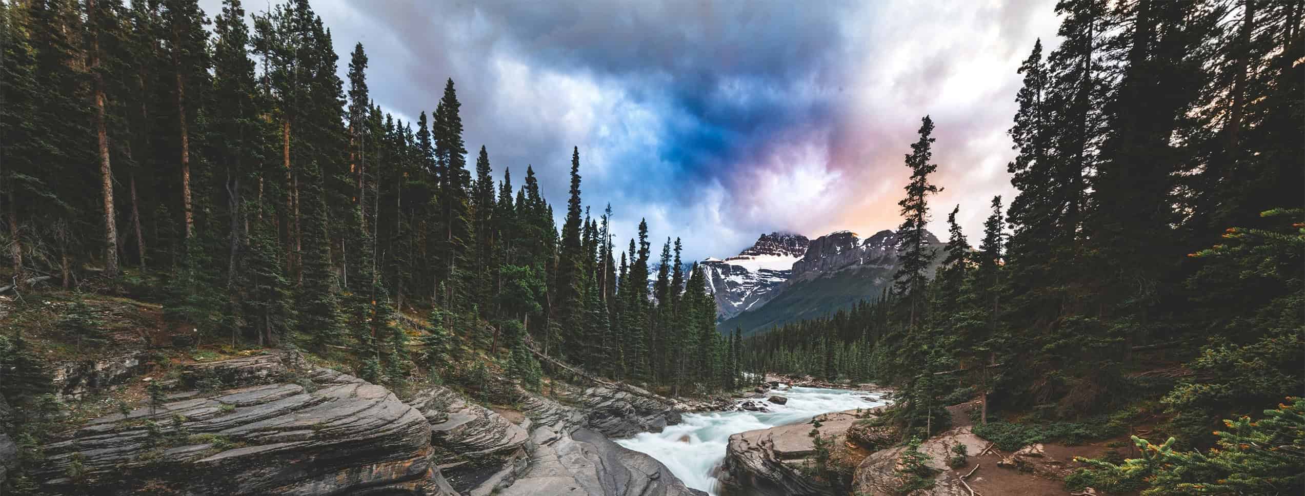
Choosing photography
Use bright, colourful photos. When possible, try to make it feel like a natural moment is captured. For more specific details about photography, check out our brand guidelines.
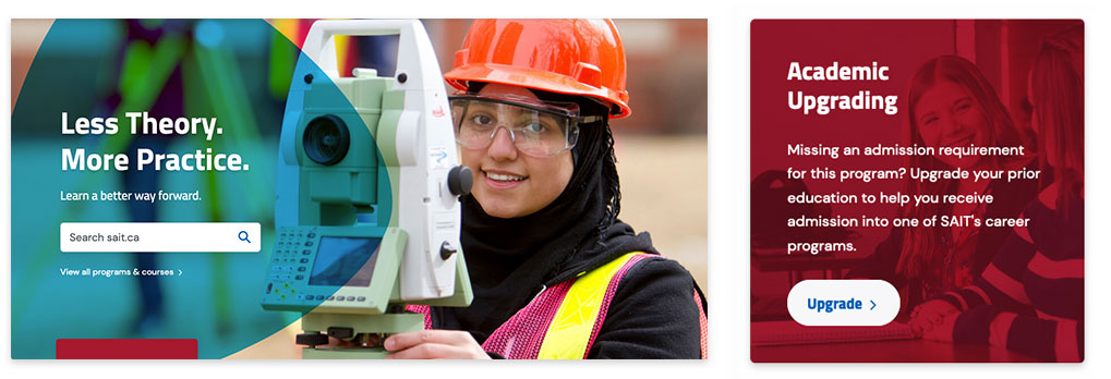
Colour and shape overlay
We often put white, bold text over photos. To make text more readable, we often use a colour or shape overlay overtop the photo background. A common shape being used across the website is the "guitar pick". When using this shape or any colour overtop of a photo, use the multiply blend mode. This might also mean adjusting the colours of the photo used.
Building blocks
For examples of basic blocks that make up sait.ca, check out our knowledge base.
Oki, Âba wathtech, Danit'ada, Tawnshi, Hello.
SAIT is located on the traditional territories of the Niitsitapi (Blackfoot) and the people of Treaty 7 which includes the Siksika, the Piikani, the Kainai, the Tsuut’ina and the Îyârhe Nakoda of Bearspaw, Chiniki and Goodstoney.
We are situated in an area the Blackfoot tribes traditionally called Moh’kinsstis, where the Bow River meets the Elbow River. We now call it the city of Calgary, which is also home to the Métis Nation of Alberta.